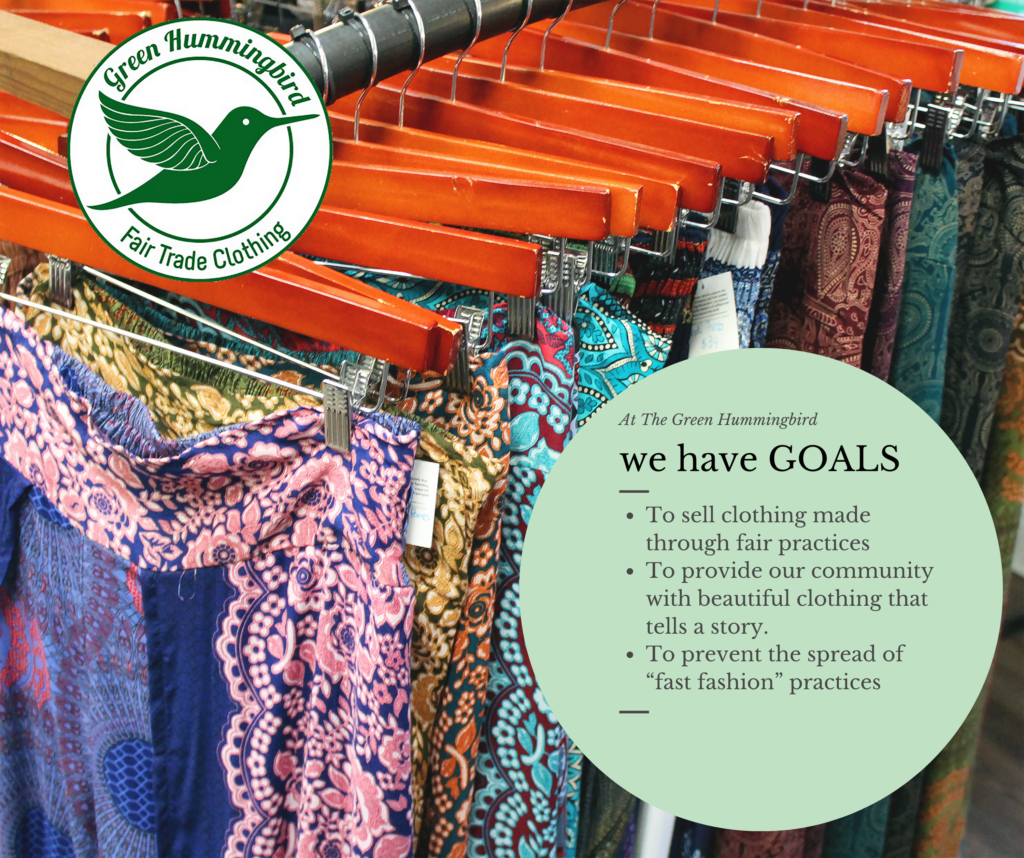
 This graphic was incorporated in the first campaign for The Green Hummingbird, which we named Meet the Green Hummingbird. The purpose of this campaign was to reinforce the preexisting social media audience of the brand narrative because 55% of consumers who love a brand’s story are willing to make a purchase (UWA Online, 2019).
 The function of emotion is to guide behavior,” so “if particular emotions generate a characteristic behavioral response, then persuasive messages may be able to exploit this effect” (Stiff & Mongeau, 2016, p.185). We also wanted to trigger an emotional response to statistical evidence about the fast fashion industry. Data can be boring when presented as plain text, but if converted to a colorful graphic, willingness to read the data increases by 80% (Green, 1989).
With the guilt that is created by revealing the truth about where fast fashion clothing comes from, cognitive dissonance is created. Cognitive dissonance is when there is inconsistency between thoughts and behavioral decisions. “People have a need for cognitive consistency”, so the psychological discomfort of guilt towards buying fast fashion products motivates behavioral change to restore cognitive balance (Stiff & Mongeau, 2016, p.84-85). We give users the opportunity to resolve cognitive dissonance of guilt by giving them a link to the website within the post and/or having it readily available on the Facebook page. Buying fair trade clothing from The Green Hummingbird is a way to resolve this dissonance.

 In this Facebook post we utilized a video done by the New York Times which featured the tragic Rana Plaza factory collapse. We chose this video in particular because research shows that narrative arcs, like Ferdous’ account of his day, provoke emotional responses from their viewers. Upon viewing videos with powerful narratives, the brains of viewers released oxytocin, increased levels of which correlated with an increase of empathetic feelings from the viewers (Zach, 2015). Due to the limitations on reposting videos on Instagram, the graphic above was created for a post to embody the devastation a fast fashion factory faced due to the inhumane safety standards.
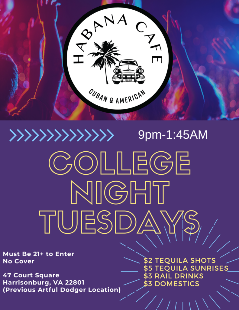
This image was created for both digital and print to promote a new event at Habana Café geared towards college students. The local university’s colors are purple and gold, which are used on the flyer to help identify the college audience. This flyer design is posted on social media platforms as well as in locations around the city. Due to the mass distribution of the flyers and allowing three week for this promotion, the first of this event went to full capacity with a constant wait outside.
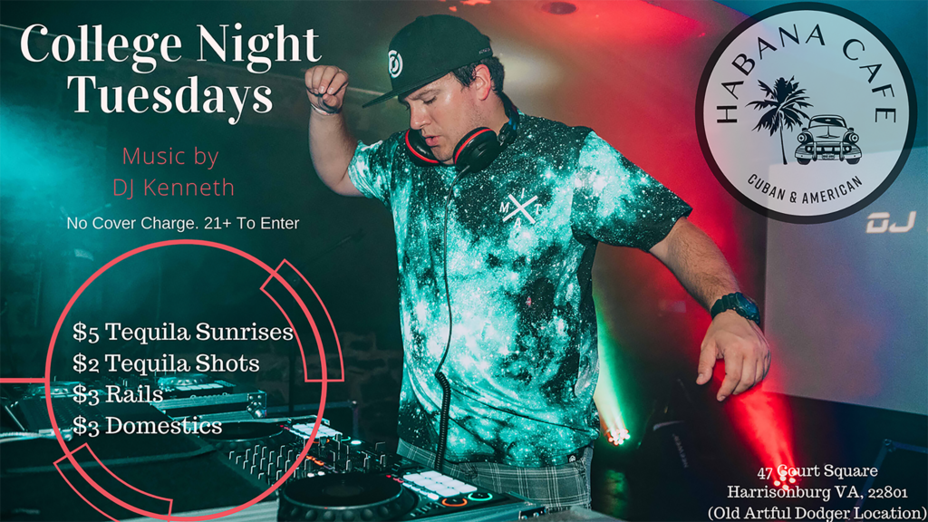
 This graphic features local college DJs for a particular weekend at Habana Café. These DJs are well known locally, so it is crucial to use headshots of the artists and their logo in order to aid the target audience in identifying them. These graphics were especially important to post on Instagram because 75% of Instagram users are between the ages of 18-24, which are the ages the majority of college students fall into (Chen, 2020).
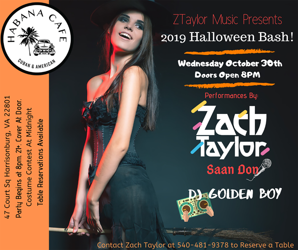 This graphic was posted all throughout October to gain attention for an annual Halloween Bash. It was important to contain all the necessary information for this special event, without overwhelming a viewer. I didn’t want the theme and target audience identity to be lost in a sea of information, so images, colors, and organizational choices were strategically made.
 The client asked me to make this graphic and provide it to him within the same day, so I had to utilize preexisting photos and design elements to produce this finished product. I was requested to have important details displayed within the graphic as well as alluring drink deals and an all around fun party aesthetic to align with the businesses brand.
 This motion GIF was posted across my clients social media pages in a post to inform viewers of a COVID-19 special so they could continue their health journey from the comfort of their own home. My client is a personal trainer and posted frequent videos during the pandemic to engage with her audience, so I choose to keep movement within static posts to a minimum to stand out from the typical content as well as to not distract the audience away from the offer.
 It was important to me that within this post users got a glimpse of what Beachbody is, while still staying consistent with branding elements in prior posts. Utilizing a majority of animated elements aided in keeping the focal point on my client’s product special and not necessarily the third party, Beachbody.
 The design practices of minimalism, simplicity, and a limited color pallet is this post (Nielsen Norman Group, 2020). With each post that offers a service, the primary colors used are blue (#254681), various colors of grey, and green (#80bd51). To keep consistency, fonts, service name placement, and logo placement can be identified in the same positions within each graphic.
 For this post, it was challenging to create an image that not only represent the program being offered, but kept consistent with the simplistic branding seen in other posts. I decided to utilize the Gestalt principle of proximity to represent how consuming healthier foods can contribute to a stronger physical appearance. With this program, making a change to what you put inside your body can create results that you can see on the outside.